Reduce portal overload
Municipal sites often carry many services, announcements and links. The interface needed clearer hierarchy and faster scanning.
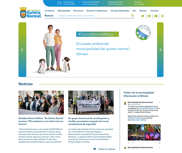
Municipal Web UX/UI
A municipal portal concept designed to make public information, services, news and priority links easier to scan across desktop and mobile.
The concept focuses on service visibility, news hierarchy, quick access links and responsive behavior, helping users find common municipal information without digging through a heavy portal.
Municipal sites often carry many services, announcements and links. The interface needed clearer hierarchy and faster scanning.
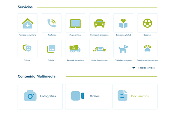
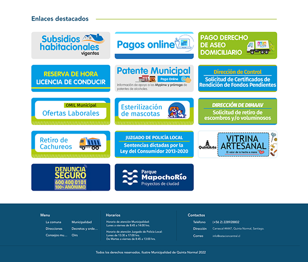
News, service cards, multimedia content and priority banners were organized into predictable modules for desktop and mobile.
The final design makes the portal feel more structured, more accessible and more useful for recurring citizen tasks.
Navigation, search, news, services, multimedia content, highlighted links and footer information were grouped by user priority.
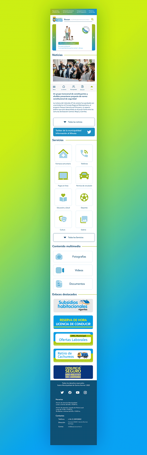
The desktop layout preserves public-service density while the mobile version stacks content into a long, clear task path.
The portal concept helps a public institution communicate more clearly and reduce friction for everyday service access.