Own the craving
The brand needed a stronger identity than product photography alone, with a look that felt crispy, fun and easy to remember.
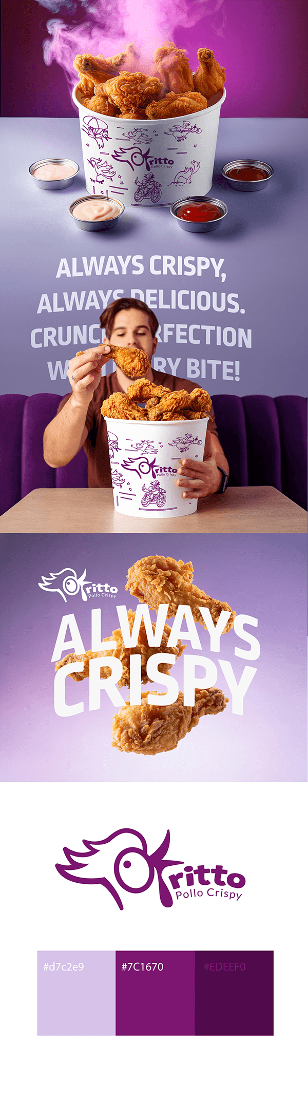
Food Brand Identity
A fried chicken identity built around appetite, texture and instant recognition. The system combines a playful logo, purple-led palette, packaging graphics and campaign-style product visuals.
Oritto needed to communicate flavor and crunch quickly while creating a visual personality that could live across packaging, campaign pieces and digital promotion.
The brand needed a stronger identity than product photography alone, with a look that felt crispy, fun and easy to remember.
A distinctive chicken mark, purple palette, illustrated bucket pattern and bold slogans create a recognizable commercial system.
The identity can extend into packaging, menus, social content and in-store campaign graphics while keeping one clear brand feeling.
Light lavender, strong purple and deep plum contrast with golden fried chicken tones to create a memorable food identity.
The concept was shaped around the sensory idea of crispiness, then expanded into logo, package pattern, campaign typography and product compositions.
The final system helps the product feel more ownable, more professional and more useful across real customer-facing materials.