Playful, not messy
Dessert brands can become visually overloaded, so the system needed simple shapes, controlled color and repeatable graphics.
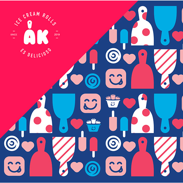
Dessert Brand Identity
A playful identity system for a dessert brand, combining rounded logo design, bright color blocking and a custom illustrated pattern language.
The brand needed to feel fun and approachable while staying clean enough to work across signage, packaging, menus and social content.
Dessert brands can become visually overloaded, so the system needed simple shapes, controlled color and repeatable graphics.
The rounded AK mark expands into a set of icons, hearts, tools and dessert graphics that build a cheerful brand world.
The final system gives the shop a recognizable foundation for packaging, signage, menus, interiors and digital content.
Hot pink, deep blue, cyan, peach and white create a vibrant identity that feels youthful and easy to recognize.
The identity started from a compact logo mark and expanded into multiple colorways, icon illustrations and a repeating pattern.
The system gives the business a visual language that can scale beyond a logo into every customer touchpoint.