Be seen in motion
A food truck brand has to be recognized fast, from a distance, while still working in close-up materials like menus and bags.
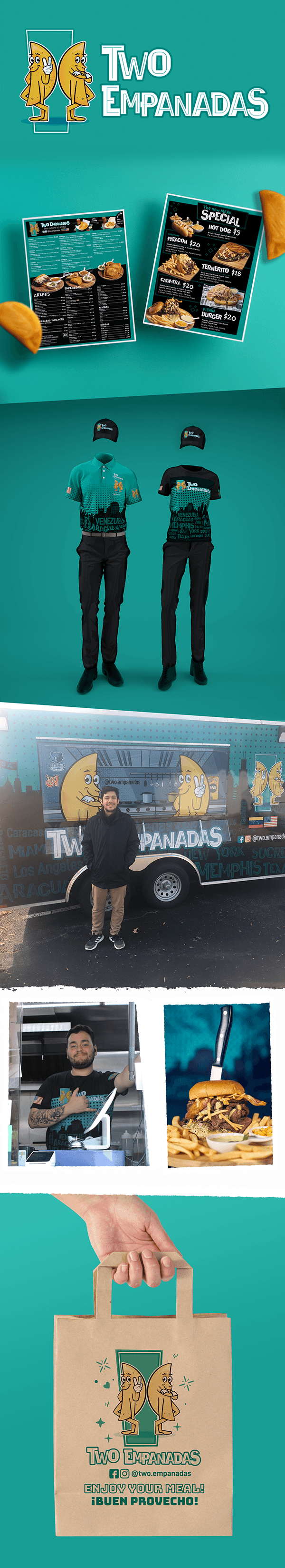
Food Truck Brand System
A full food truck identity with mascot illustration, menus, uniforms, packaging and vehicle graphics built to make the business feel unified in public.
The brand needed to work everywhere people encounter the business: on the truck, on staff apparel, on printed menus, on packaging and in food photography.
A food truck brand has to be recognized fast, from a distance, while still working in close-up materials like menus and bags.
The empanada becomes a character-driven brand element supported by a strong teal palette and practical application system.
The truck, staff, packaging and menus feel connected, helping the business look more established and memorable.
Teal, dark teal, golden food tones and bold black/white accents create a friendly, practical and recognizable brand system.
The identity moved from logo and mascot into real applications: menus, specials, uniforms, vehicle graphics and branded packaging.
The system helps the business show up consistently at events, on the street and in every customer interaction.